Seems it announces Samplers sample packs.
Anyway, I think it is too crowded.
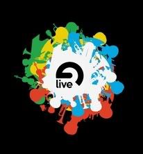
Live's graphics have been clean and with intelligent space.
This new logo does not appeal to me.
More abstract like before, please.
/ C
Live 6 splash/logo
Live 6 splash/logo
PC Laptop Acer, XP Home SP2, build in crappy sound card.
Bleeps and Blops!
http://bluemoose.greatnow.com/
Bleeps and Blops!
http://bluemoose.greatnow.com/
i think its cool
.
.
--
NEW SPECS: Athlon 4200+ dual; A8N-SLI m/b; Win XP Home SP2; 1 GB RAM; 2x 7200 RPM HDD: 1 internal, 1 Firewire 800 (Firewire is project data drive); M-Audio Triggerfinger
josh 'vonster' von; tracks and sets
http://www.joshvon.com
NEW SPECS: Athlon 4200+ dual; A8N-SLI m/b; Win XP Home SP2; 1 GB RAM; 2x 7200 RPM HDD: 1 internal, 1 Firewire 800 (Firewire is project data drive); M-Audio Triggerfinger
josh 'vonster' von; tracks and sets
http://www.joshvon.com
I don't like it too much, it's Jolly I suppose but when you realise it resolves too easily into violins and trombones it loses something. Like someone searched their clipart folder using the keyword 'music' and only turned up 3 vectors. Violin, trombone, grand piano.
Although, I do like the little tiny grand piano which is off on its own - bottom left. Helloo little piano!
That one is kind of comical.
Although, I do like the little tiny grand piano which is off on its own - bottom left. Helloo little piano!
That one is kind of comical.
-
DeadlyKungFu
- Posts: 3603
- Joined: Tue Aug 09, 2005 8:26 pm
the abstract reverse 'e' design is still there.
Yeah, the new one could use more relevant instruments, turntable needle, microphone, there's pianos but keys would look better, no drums, too many horns. Doesn't really matter, a rose by another other name is still a rose.
Most of all there aren't any musical notes.
Yeah, the new one could use more relevant instruments, turntable needle, microphone, there's pianos but keys would look better, no drums, too many horns. Doesn't really matter, a rose by another other name is still a rose.
Most of all there aren't any musical notes.
-
Johnisfaster
- Posts: 7251
- Joined: Thu Sep 29, 2005 8:34 am
- Contact:
I think it's a good idea that they are associating themselves with instruments that aren't usually associated with them. someone might think "maybe I'll try sending my trumpet through live and do live looping with it or run it through the graindelay"
I think it'll help people to not think so inside the box when choosing instruments. mic, turntable, synth. not that people are gonna see the splash and think "wow I'm gonna try a violin. but these kinds of things sit in our subconcious and when a music program associates itself with something then those associations become second nature. I think they are focusing more and more on the idea of live music and production and less and less on dj'ing.
I think it'll help people to not think so inside the box when choosing instruments. mic, turntable, synth. not that people are gonna see the splash and think "wow I'm gonna try a violin. but these kinds of things sit in our subconcious and when a music program associates itself with something then those associations become second nature. I think they are focusing more and more on the idea of live music and production and less and less on dj'ing.
It was as if someone shook up a 6 foot can of blood soda and suddenly popped the top.
that's the best i could get from the splashscreen.stinky wrote:anybody know where to find a larger bitmap, or image of the logo.. this one is small. and i'd like to see it in all it's glory.. maybe there's a live logo graveyard somewhere that someone has a link to?
http://www.yousendit.com/transfer.php?a ... BE49978827

The logo reflects the sort of way the company is going. Minimal to Maximal. What can you make as easy as possible but have it do the most as possible? It sounds sort of wierd when I type it. lol
Every situation(1) should be confronted with its opposite(2) to come to a better situation(3).
1 Thesis
2 Antithesis
3 Synthesis
- Hegel
1 Thesis
2 Antithesis
3 Synthesis
- Hegel
I think that is a pretty insulting statement, when after all so many professional graphic designers are pretty awful, even.ekko wrote:A committee of high school graphic-artist wannabes.
I disagree. I like this Logo alot. And, uh, I've been working in graphic design in school now on and off for about 8 years. Of course it is just a matter of opinion, but I am sparing you a thorough academic breakdown of why I think this logo works functionally and aesthetically. It's smart, works large and small, and uniformally resolves it'self in multiple hierarchical layers of interpretation. I want to go on... spirals... aaaghhh....
I think this is important, because the instruments that they seem to have shown in the logo are typically the ones that sound the most unconvincing if not just down-right-awful when simulated by a digital instrument.Johnisfaster wrote:I think it's a good idea that they are associating themselves with instruments that aren't usually associated with them.
What I am HOPING is that they have found away with their particular design of Sampler to pull of these horn and stringed instruments adequately, if not just competetively. I have said it before and I will say it again: a varied inclusion of these instruments will most likely determine whether or not I purchase the EIC.
